CustomPage Demo: Block Types & Elements
This page demonstrates every block type and rich text element available in the CustomPage system. Use it as a reference when building new pages.
Rich Text Elements
Regular text, bold text, italic text, bold italic, underline, strikethrough, and inline code.
Heading 3 — Subsection
Heading 4 — Minor heading
Unordered list:
- First bullet point
- Second bullet point
- Third bullet point with longer text to show wrapping behavior
Ordered list:
- First numbered item
- Second numbered item
- Third numbered item
A blockquote-style paragraph with italic formatting for emphasis.
Image Embeds & Width Control
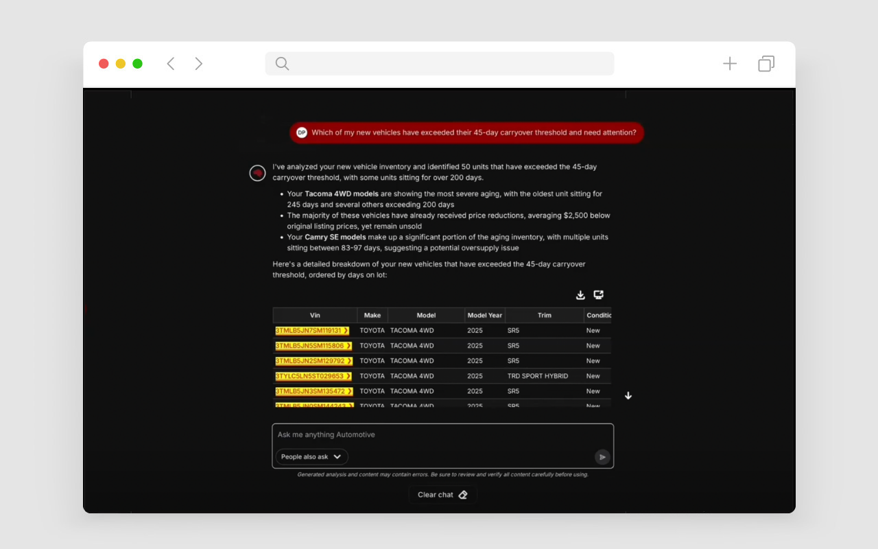
Images can be embedded in rich text via the upload node. By default, images stretch to 100% of the column width. You can override this by setting a custom width in the upload field properties.
Full Width (default)
No width override — the image fills the entire column:
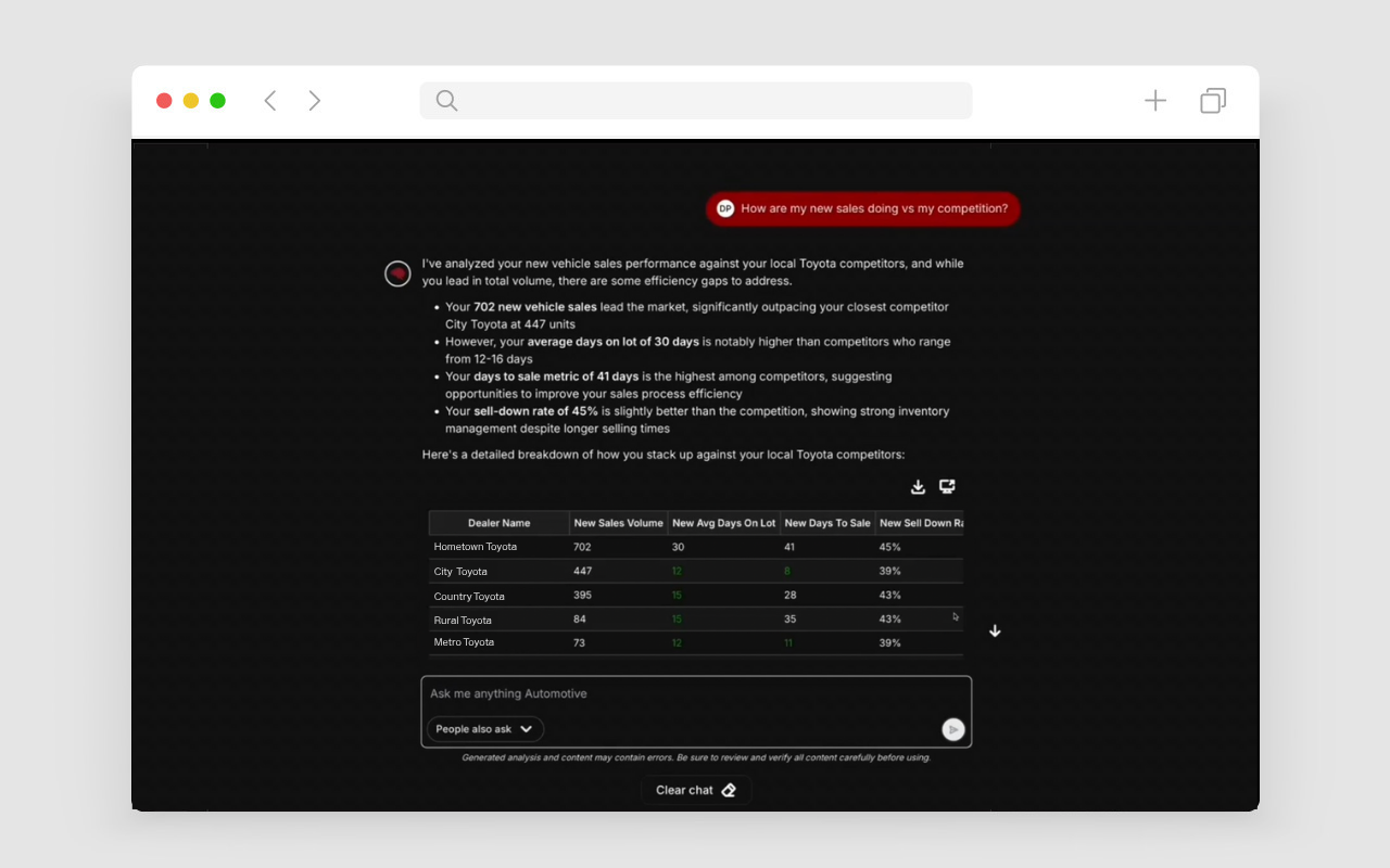
Custom Width: 50%
Setting width: "50%" constrains the image to half the column width:
Custom Width: 75%
Setting width: "75%":
Small Icon Size: 100px
For icons or small graphics, use a small fixed width like width: "100px":
Note: The width property is set in the Lexical upload node's fields.width value. It accepts any valid CSS width string (e.g. "50%", "300px", "20rem"). When no width is set, images default to 100% of the column.
Two-Column Layout
This is the left column. Two-column layouts split content into equal halves. Great for side-by-side comparisons, text + image, or parallel content.
- Feature one
- Feature two
- Feature three
Right Column
This is the right column. Each column supports full rich text including headings, lists, images, and formatted text.
Use two-column blocks for balanced layouts where both sides carry equal visual weight.
Column 1
Three-column layouts work well for feature grids, comparison tables, or card-like content.
Column 2
The center column gets equal width. Each column supports all rich text features independently.
Column 3
Use three columns for categories, pricing tiers, or step-by-step flows.
Asymmetric Layout (2/3 + 1/3)
This is the wide column (2/3). Asymmetric layouts are ideal for main content with a sidebar, article with metadata, or content with a call-to-action panel.
The wider column typically holds the primary content while the narrower column serves a supporting role.
Sidebar
This is the narrow column (1/3).
Use for: navigation, CTAs, quick stats, or related links.

Asymmetric Layout (1/3 + 2/3)
This is the wide column (2/3) on the right side. The ratio is flipped from the previous block.
This layout works well when the sidebar content should appear first visually, such as an icon or label column.
Left Sidebar
Narrow column (1/3) on the left.
The sides swap depending on the ratio setting.
Button Row Block
Button rows support left, center, and right alignment with solid and outline variants:
Left-aligned:
Centered (with 3 buttons, including external link):
Right-aligned:
Inline Video Embeds
YouTube and Vimeo videos can be embedded directly within rich text content using the Video Embed block. Insert them via the slash menu or the toolbar block insert button in the editor.
YouTube Video with Caption

Video Without Caption
The caption field is optional:

Videos maintain a 16:9 aspect ratio and are fully responsive. They can be placed anywhere within rich text content.
Divider Styles
Above: large space divider. Below are all four divider styles in sequence:
Line ↓
Small space ↓
Medium space ↓
Large space ↓
↑ End of divider demos
HubSpot Form Block
A standalone form block embeds a HubSpot form at full width:
Hero + Form Block
This is the hero-form layout. The left column holds rich text content (headings, paragraphs, images, lists) and an optional video embed.
The right column renders a HubSpot form inside a card with an optional heading.
- Supports all rich text elements in the body
- Optional YouTube video below the body content
- Form card with configurable heading